
Map Plots Created With R And Ggmap
In my previous tutorial we created heat maps of Seattle 911 call volume by various time periods and groupings. The analysis was based on a dataset which provides Seattle 911 call metadata. It's available as part of the data.gov open data project. The results were really neat, but it got me thinking - we have latitude and longitude within the dataset, so why don't we create some geographical graphs?
Y'all know I'm a sucker for a beautiful data visualizations and I know just the package to do this: GGMAP! The ggmap package extends the ever-amazing ggplot core features to allow for spatial and geographic visualization.
So let's get going!
Set Up R
In terms of setting up the R working environment, we have a couple of options open to us. We can use something like R Studio for a local analytics on our personal computer. Or we can use a free, hosted, multi-language collaboration environment like Watson Studio. If you'd like to get started with R in IBM Watson Studio, please have a look at the tutorial I wrote.
Install And Load R Packages
R packages contain a grouping of R data functions and code that can be used to perform your analysis. We need to install and load them in your environment so that we can call upon them later. If you are in Watson Studio, enter the following code into a new cell, highlight the cell and hit the "run cell" button. Note that due to some recent changes in the “Google Maps Static API” which the ggmap package calls upon, we will load ggmap at a later time.
# Install the relevant libraries - do this one time
install.packages("lubridate")
install.packages("ggplot2")
install.packages("data.table")
install.packages("ggrepel")
install.packages("dplyr")
install.packages("data.table")
install.packages("tidyverse")
If in Watson Studio, you may get a warning note that the package was installed into a particular directory as 'lib' is unspecified. This is completely fine. It still installs successfully and you will not have any problems loading it in the next step. After you successfully install all the packages, you may want to comment out the lines of code with a "#" in front of each line. This will help you to rerun all code at a later date without having to import in all packages again. As done previously, enter the following code into a new cell, highlight the cell and hit the "run cell" button.
# Load the relevant libraries - do this every time
library(lubridate)
library(ggplot2)
library(dplyr)
library(data.table)
library(ggrepel)
library(tidyverse)
Load Data File into R and Assign Variables
Rather than loading the data set right from the data.gov website as we did in the previous tutorial, I've decided to pre-download and sample the data for you all. Map based graphs can take a while to render and we don't want to compound this issue with a large data set. The resulting dataset can be loaded as step A below.
In step B, I found a website which outlined their opinion on the most dangerous Seattle cities. I thought it would be fun to layer this data on top of actual 911 meta data to test how many dangerous crimes these neighborhoods actually see.
#A) Download the main crime incident dataset

incidents= read.csv('https://raw.githubusercontent.com/lgellis/MiscTutorial/master/ggmap/i2Sample.csv', stringsAsFactors = FALSE)

#B) Download the extra dataset with the most dangerous Seattle cities as per:

# https://housely.com/dangerous-neighborhoods-seattle/

n <- read.csv('https://raw.githubusercontent.com/lgellis/MiscTutorial/master/ggmap/n.csv', stringsAsFactors = FALSE)

# Look at the data sets

dim(incidents)

head(incidents)

attach(incidents)

dim(n)

head(n)

attach(n)

# Create some color variables for graphing later

col1 = "#011f4b"

col2 = "#6497b1"

col3 = "#b3cde0"

col4 = "#CC0000"
Transform Variables in R
We are going to do a few quick transformations to calculate the year and then subset the years to just 2017 and 2018. We are then going filter out any rows with missing data. Finally, we are creating a display label to use when marking the dangerous neighborhoods from the housely website review.
#add year to the incidents data frame
incidents$ymd <-mdy_hms(Event.Clearance.Date)
incidents$year <- year(incidents$ymd)

#Create a more manageable data frame with only 2017 and 2018 data
i2 <- incidents %>%
  filter(year>=2017 & year<=2018)

#Only include complete cases
i2[complete.cases(i2), ]

#create a display label to the n data frame (dangerous neighbourhoods)
n$label <-paste(Rank, Location, sep="-")
Enable Google Static Map Service For ggmap
If you used this package prior to July 2018, you may were likely able to do so without signing up for the google static map service yourself. However, at this time, the service now requires individual sign up and also billing enablement. The billing enablement especially is a bit of a downer, but you can use the free tier without incurring charges. Also, the service being exposed through an easy to use r package that extends ggplot2 is pretty great so I’ll allow it.
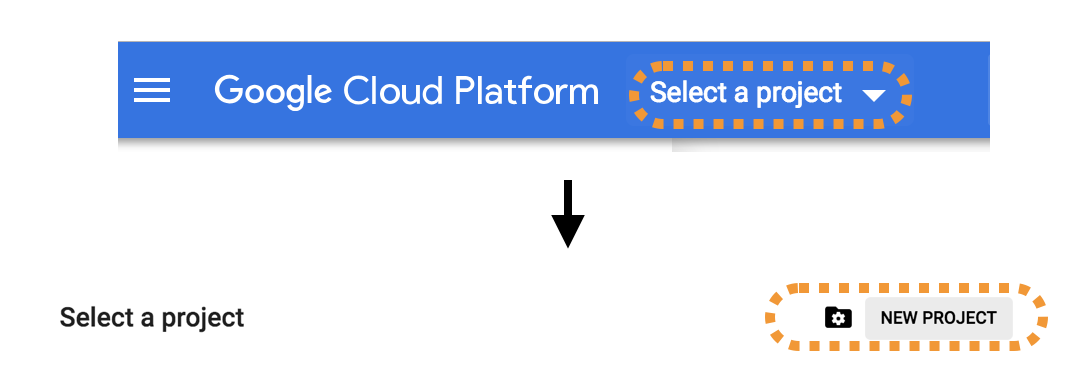
Visit - https://console.cloud.google.com and sign up for a google cloud platform trial.
Create a project. In the top nav, you can either select an existing project or create a new one.
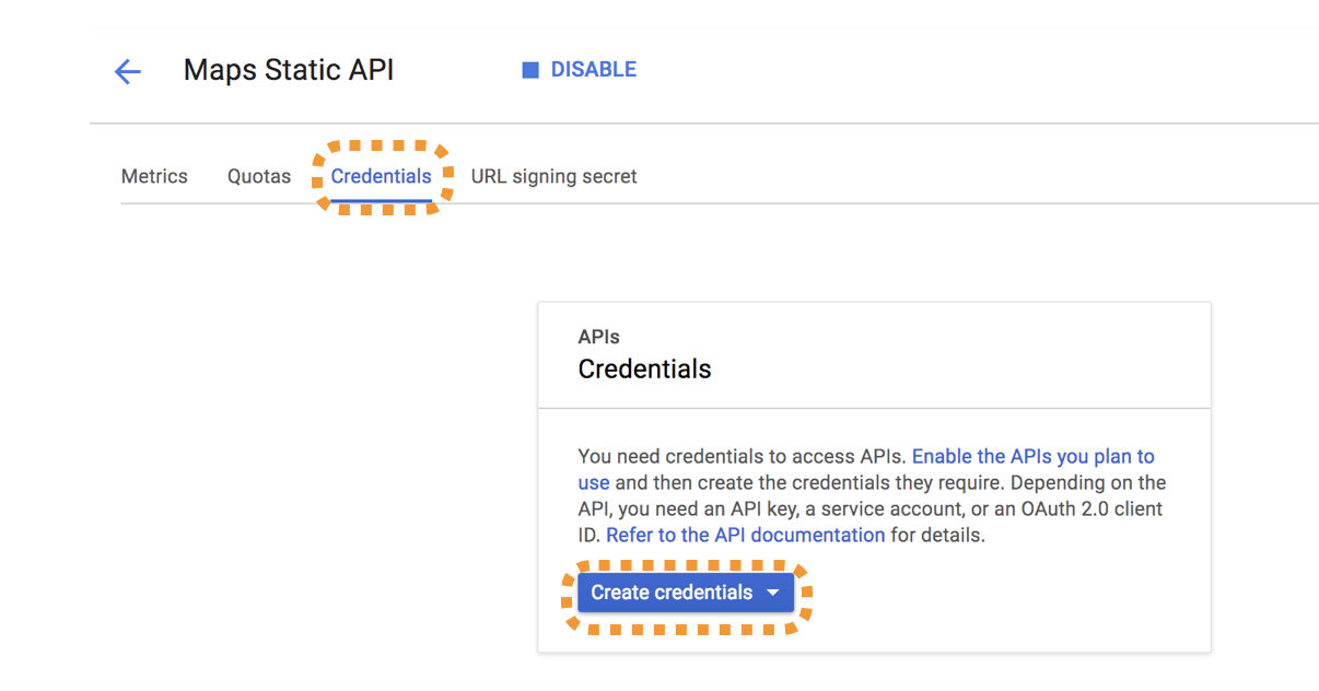
Add the “Maps Static API” service to the project. Navigate to the library of API services and search for “Maps Static API”. Enable the service.

Generate an API Key. Navigate to the credentials area and select “Create credentials”. Take note of your API key. You will need to register it with the package later.
Install the ggmap R package and set the API key within R by executing the commands as below.
#More Q&A - https://github.com/dkahle/ggmap/issues/51

#Get the latest Install
if(!requireNamespace("devtools")) install.packages("devtools")
devtools::install_github("dkahle/ggmap", ref = "tidyup", force=TRUE)

#Load the library
library("ggmap")

#Set your API Key
ggmap::register_google(key = "SET YOUR KEY HERE")

#Notes: If you get still have a failure then I suggest to restart R and run the library and register google commands again.
Start Making Maps!
R Map 1: Incident occurrences color coded by group
In this map we are simply creating the ggmap object called p which contains a Google map of Seattle. We are then adding a classic ggplot layer (geom_point) to plot all of the rows in our i2 data set.
##1) Create a map with all of the crime locations plotted.

p <- ggmap(get_googlemap(center = c(lon = -122.335167, lat = 47.608013),
                    zoom = 11, scale = 2,
                    maptype ='terrain',
                    color = 'color'))
p + geom_point(aes(x = Longitude, y = Latitude,  colour = Initial.Type.Group), data = i2, size = 0.5) +
  theme(legend.position="bottom")
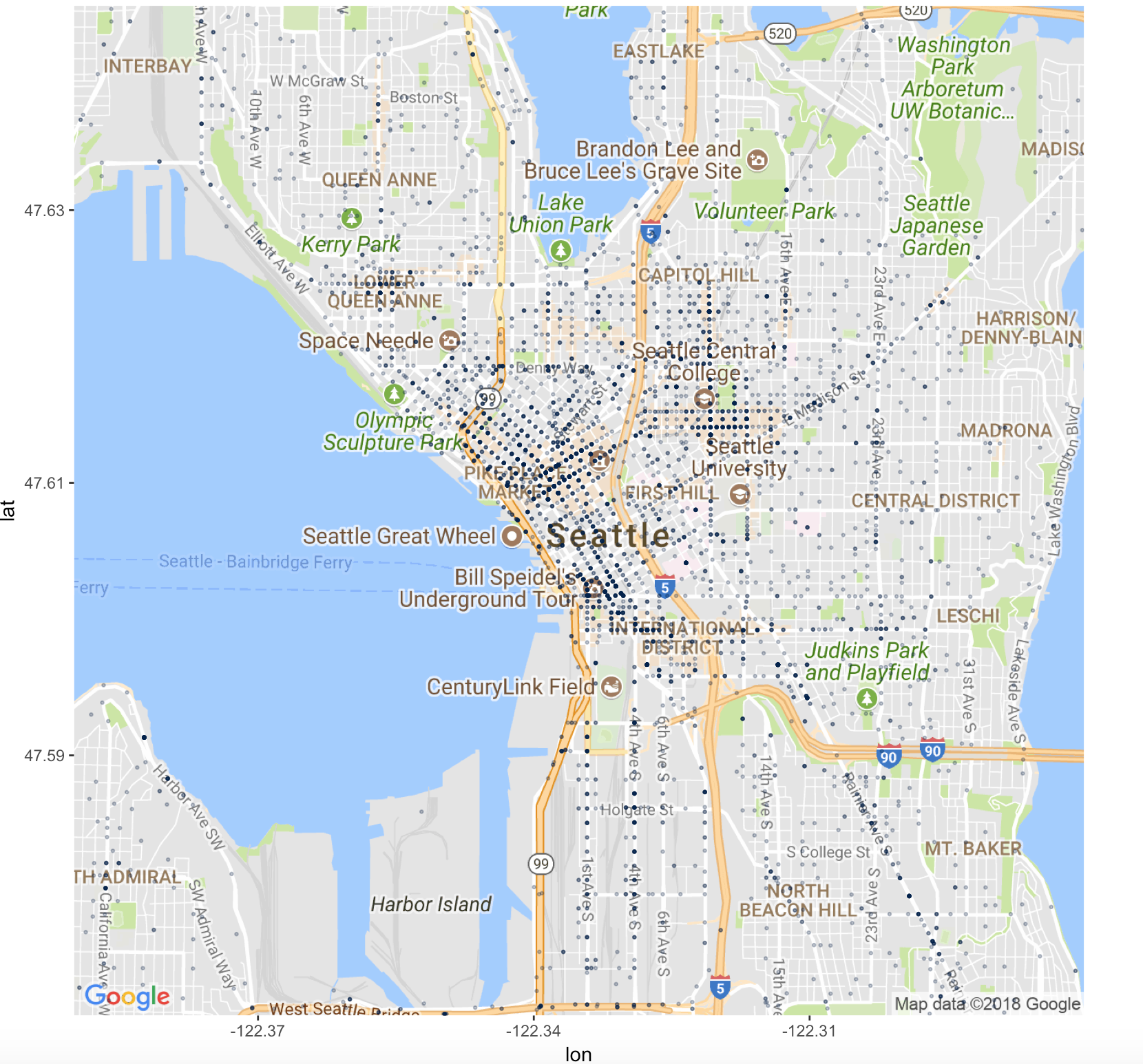
R Map 2: Incident occurrences using one color with transparency
In the last map, it was a bit tricky to see the density of the incidents because all the graphed points were sitting on top of each other. In this scenario, we are going to make the data all one color and we are going to set the alpha variable which will make the dots transparent. This helps display the density of points plotted.
Also note, we can re-use the base map created in the first step "p" to plot the new map.
##2) Deal with the heavy population by using alpha to make the points transparent.

p +   geom_point(aes(x = Longitude, y = Latitude), colour = col1, data = i2, alpha=0.25, size = 0.5) +
  theme(legend.position="none")

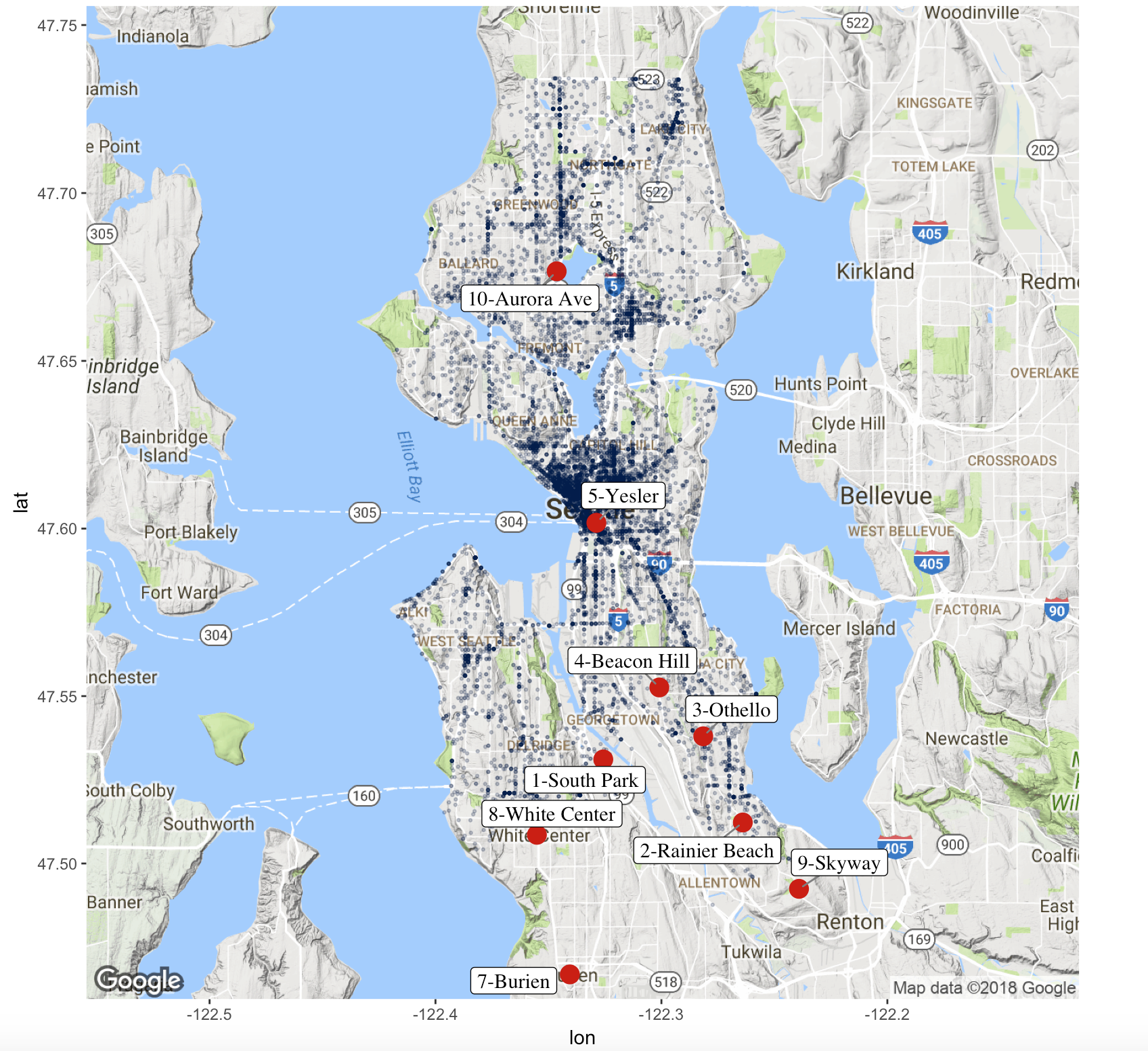
R Map 3: Incident occurrences + layer of "most dangerous neighborhood" location markers
In this map, we are going to use the excellent ggplot feature of layering. We will take the map above and layer on the data points from the "n" dataset which outlines the "most dangerous neighborhoods" in Seattle as determined by housely.com
We accomplish this by adding another geom_point layer plotting the n dataset. We set the geom_point shape to be different for each neighbourhood. Finally, since there are 10 neighbourhoods, we use the scale_shape_manual feature to plot more than the default 6 shapes available with the shape option with geom_point.
# #3) Do the same as above, but use the shape to identify the "most dangerous" neighbourhoods.

n$Neighbourhood <- factor(n$Location)
p + geom_point(aes(x = Longitude, y = Latitude), colour = col1, data = i2, alpha=0.25, size = 0.5) +
  theme(legend.position="bottom")  +
  geom_point(aes(x = x, y = y, shape=Neighbourhood, stroke = 2), colour=col4, data = n, size =3) +
  scale_shape_manual(values=1:nlevels(n$Neighbourhood))

R Map 4: Incident occurrences + layer of "most dangerous neighbourhood" with labels (vs shapes)
In this map, we are going to change from shape based neighbourhood identifiers to labels. In our case, labelling is a bit more tricky than normal because we are using two different data sets within the same graph. This means that we can't use geom_text. However, geom_label_repel does the job very nicely!
## 4a) Need to use geom_label_repel since there are multiple layers using different data sets.

p + geom_point(aes(x = Longitude, y = Latitude), colour = col1, data = i2, alpha=0.25, size = 0.5) +
  theme(legend.position="bottom")  +
  geom_point(aes(x = x, y = y, stroke = 2), colour=col4, data = n, size =2.5) +
  geom_label_repel(
    aes(x, y, label = label),
    data=n,
    family = 'Times',
    size = 4,
    box.padding = 0.2, point.padding = 0.3,
    segment.color = 'grey50')
R Map 5: Re-do above R plot to only show the most dangerous crimes
The above plot seemed to indicate that crime was not the most dense around the housely.com identified "dangerous neighborhoods". To ensure we're being fair, let's subset the data to only include very obviously dangerous crimes and re-plot.
## 5) Do a more fair check to see if the neighbourhoods are more "dangerous" b/c of dangerous
# crimes (vs all incidents)

unique(i2$Event.Clearance.Group)
i2Dangerous <-filter(i2, Event.Clearance.Group %in% c('TRESPASS', 'ASSAULTS', 'SUSPICIOUS CIRCUMSTANCES',
                                                      'BURGLARY', 'PROWLER', 'ASSAULTS', 'PROPERTY DAMAGE',
                                                      'ARREST', 'NARCOTICS COMPLAINTS','THREATS', 'HARASSMENT', 'WEAPONS CALLS',
                                                      'PROSTITUTION' , 'ROBBERY', 'FAILURE TO REGISTER (SEX OFFENDER)', 'LEWD CONDUCT',
                                                      'HOMICIDE'))
attach(i2Dangerous)

p + geom_point(aes(x = Longitude, y = Latitude), colour = col1, data = i2Dangerous, alpha=0.25, size = 0.5) +
  theme(legend.position="bottom")  +
  geom_point(aes(x = x, y = y, stroke = 2), colour=col4, data = n, size =1.5) +
  geom_label_repel(
    aes(x, y, label = label),
    data=n,
    family = 'Times',
    size = 3,
    box.padding = 0.2, point.padding = 0.3,
    segment.color = 'grey50')

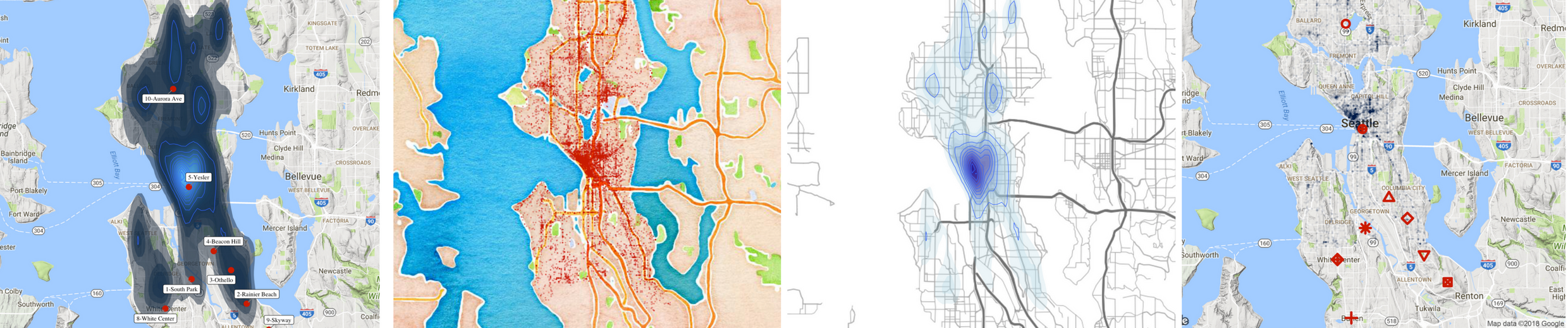
R Map 6: Incident occurrence density plot + layer of "most dangerous neighborhood" with labels
We're going to now modify the incident occurrence layer to plot the density of points vs plotting each incident individually. We accomplish this with the stat_density2d function vs geom_point.
## 6) View in a density Plot
p + stat_density2d(
    aes(x = Longitude, y = Latitude, fill = ..level.., alpha = 0.25),
    size = 0.01, bins = 30, data = i2Dangerous,
    geom = "polygon"
  ) +
  geom_point(aes(x = x, y = y, stroke = 2), colour=col4, data = n, size =1.5) +
  geom_label_repel(
    aes(x, y, label = label),
    data=n,
    family = 'Times',
    size = 3,
    box.padding = 0.2, point.padding = 0.3,
segment.color = 'grey50') 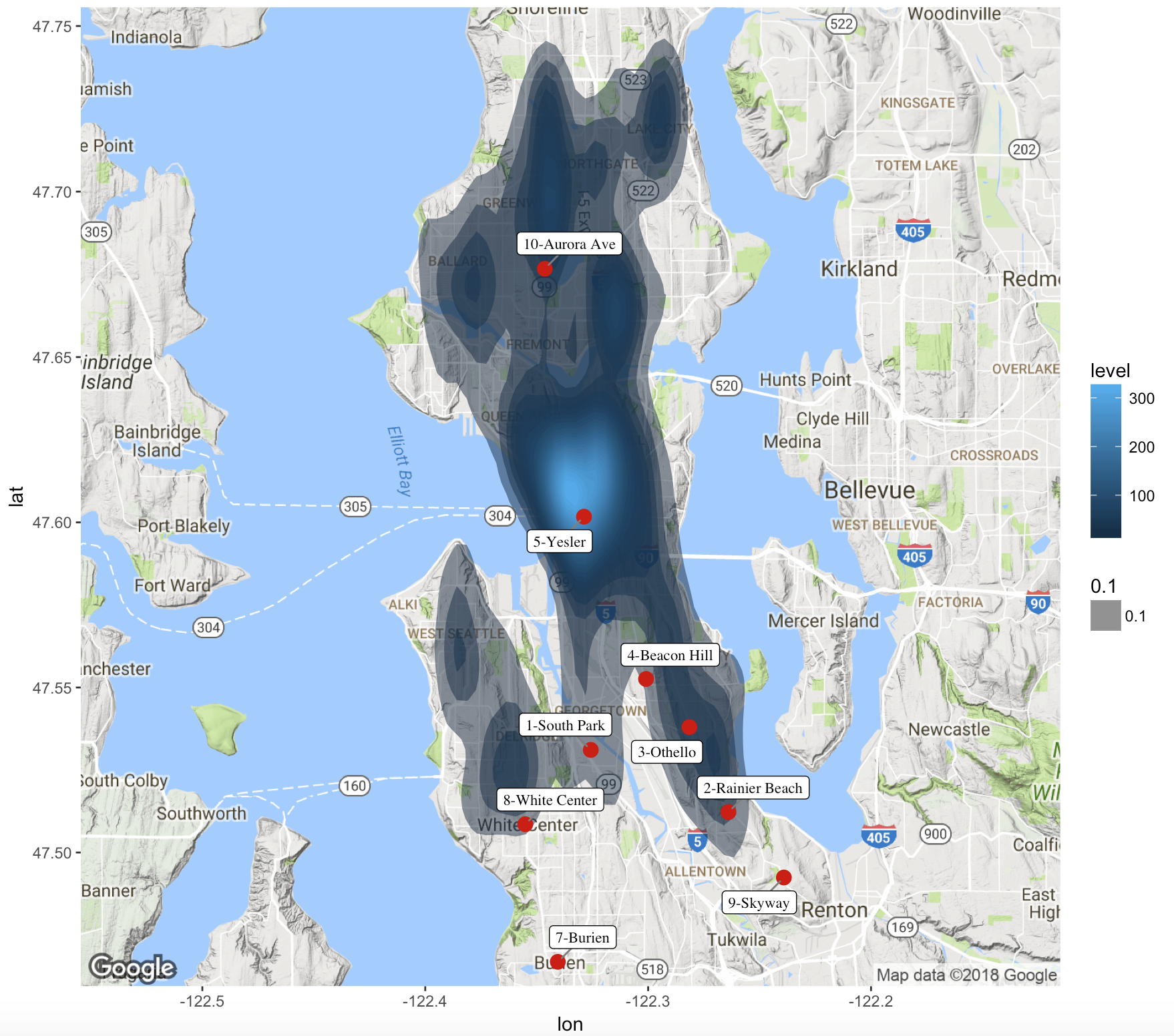
R Map 7: Incident occurrence density plot + density lines + layer of "most dangerous neighborhood" with labels
In this map, we are just going to build slightly on map 6, by further highlighting density estimates with density line using the geom_density2d function.
#7)  Density with  alpha set to level
## have to make a lot of bins given the difference in volumes. Add geom_density to put in grid lines
p + stat_density2d(
    aes(x = Longitude, y = Latitude, fill = ..level.., alpha = 0.25),
    size = 0.1, bins = 40, data = i2Dangerous,
    geom = "polygon"
  ) +
  geom_density2d(data = i2,
               aes(x = Longitude, y = Latitude), size = 0.3) +
  geom_point(aes(x = x, y = y, stroke = 2), colour=col4, data = n, size =1.5)+
  geom_label_repel(
    aes(x, y, label = label),
    data=n,
    family = 'Times',
    size = 3,
    box.padding = 0.2, point.padding = 0.3,
    segment.color = 'grey50')

R Map 8: Incident occurrence density plot + density lines + facet wrap for the highest occurring incident types
In map 8 we are going to keep the density plotting with stat_density2d and geom_density2d, but we are going to scale the transparency with the density as well using alpha=..level.. Additionally, we are going to display a breakout of the top four occurring incidents. We start off by creating a subset data frame called i2Sub containing only records pertaining to the top 4 incident groups. We then create a group based breakdown with the facet_wrap function.
#8) Density chart with graph lines and facet wrap
i2Sub <-filter(i2, Event.Clearance.Group %in% c('TRAFFIC RELATED CALLS', 'DISTURBANCES', 'SUSPICIOUS CIRCUMSTANCES', 'MOTOR VEHICLE COLLISION INVESTIGATION'))
dim(i2Sub)
attach(i2Sub)

p + stat_density2d(
    aes(x = Longitude, y = Latitude, fill = ..level.., alpha =..level..),
    size = 0.2, bins = 30, data = i2Sub,
    geom = "polygon"
  ) +
  geom_density2d(data = i2Sub,
                 aes(x = Longitude, y = Latitude), size = 0.3) +
  facet_wrap(~ Event.Clearance.Group, nrow=2)
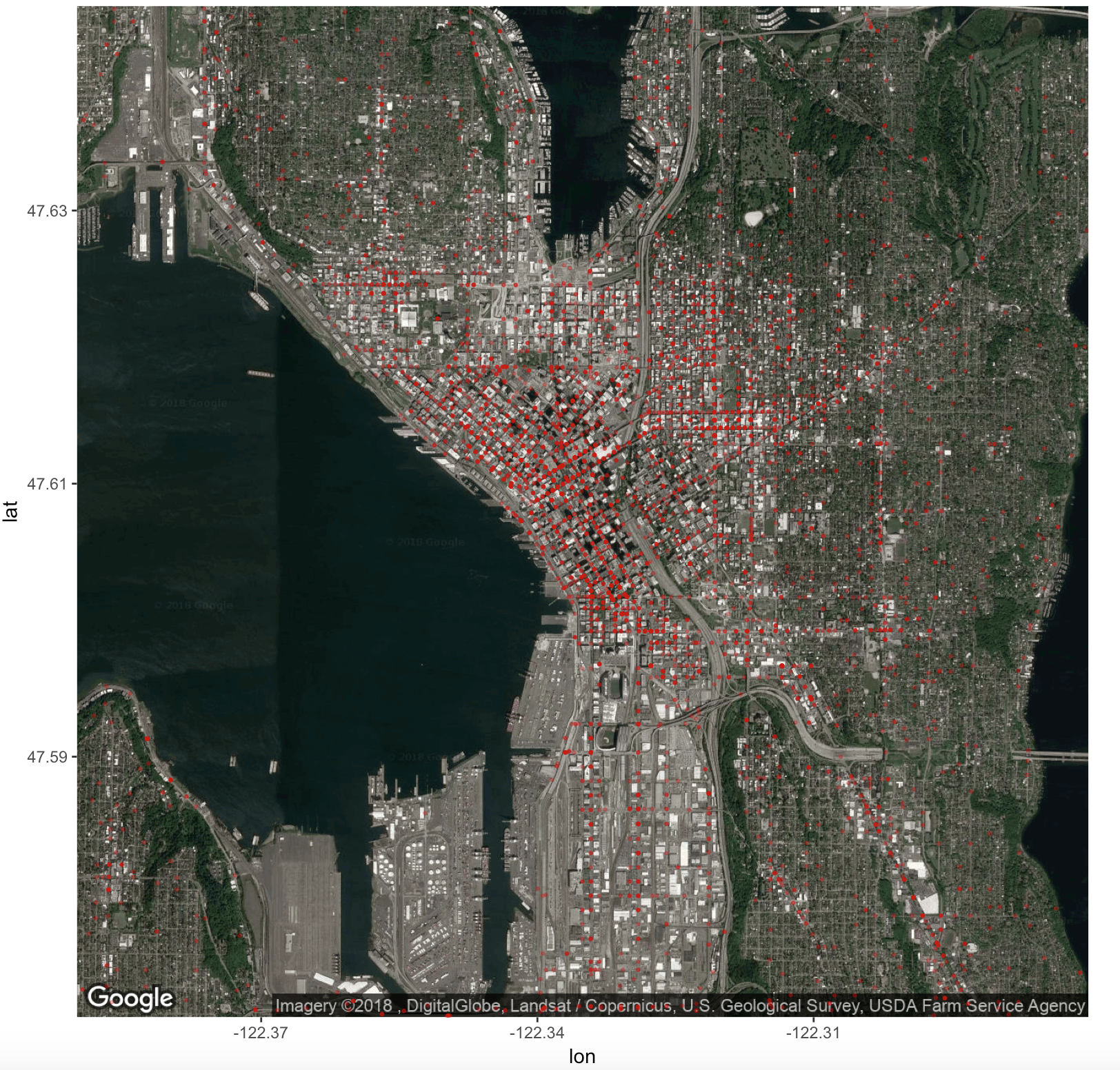
R Map 9: Change maptype and style
Up until now we've been using the terrain map type in google maps. We are now going to explore their other map types: roadmap, terrain, hybrid, satellite. You can specify this with the maptype option in the get_googlemap function. I encourage y'all to try out a bunch maptype and feature combinations. I chose a zoomed in roadmap + black geom_point and satellite + red geom_point. I thought it was really neat to see how the incidents followed the major streets.
#9a) roadmap + black geom_point
p + geom_point(aes(x = Longitude, y = Latitude), colour = "black", data = i2, alpha=0.3, size = 0.5) +
  theme(legend.position="none")


#9b) satellite + red geom_point
p + geom_point(aes(x = Longitude, y = Latitude), colour = col4, data = i2, alpha=0.3, size = 0.5) +
  theme(legend.position="none")
Map 10: Change map provider and type
In our final step, we are going to change the map provider to stamen. Just like google maps there are a number of maptypes you can specify. In the below examples we are using terrain-lines+ blue density map and a watercolor maptype + red geom_point.
# 10) Use qmap to change the chart provider to stamen - do maptype = "watercolor", "terrain-lines'
# 10a) terrain-lines + blue density
# Note: see update if you run into issues.
center = c(lon = -122.335167, lat = 47.608013)
qmap(center, zoom = 11, source = "stamen", maptype = "terrain-lines") +
stat_density2d(
aes(x = Longitude, y = Latitude, fill = ..level..),
alpha = 0.25, size = 0.2, bins = 30, data = i2,
geom = "polygon"
) + geom_density2d(data = i2,
aes(x = Longitude, y = Latitude), size = 0.3) +
scale_fill_gradient(low = "light blue", high= "dark blue")
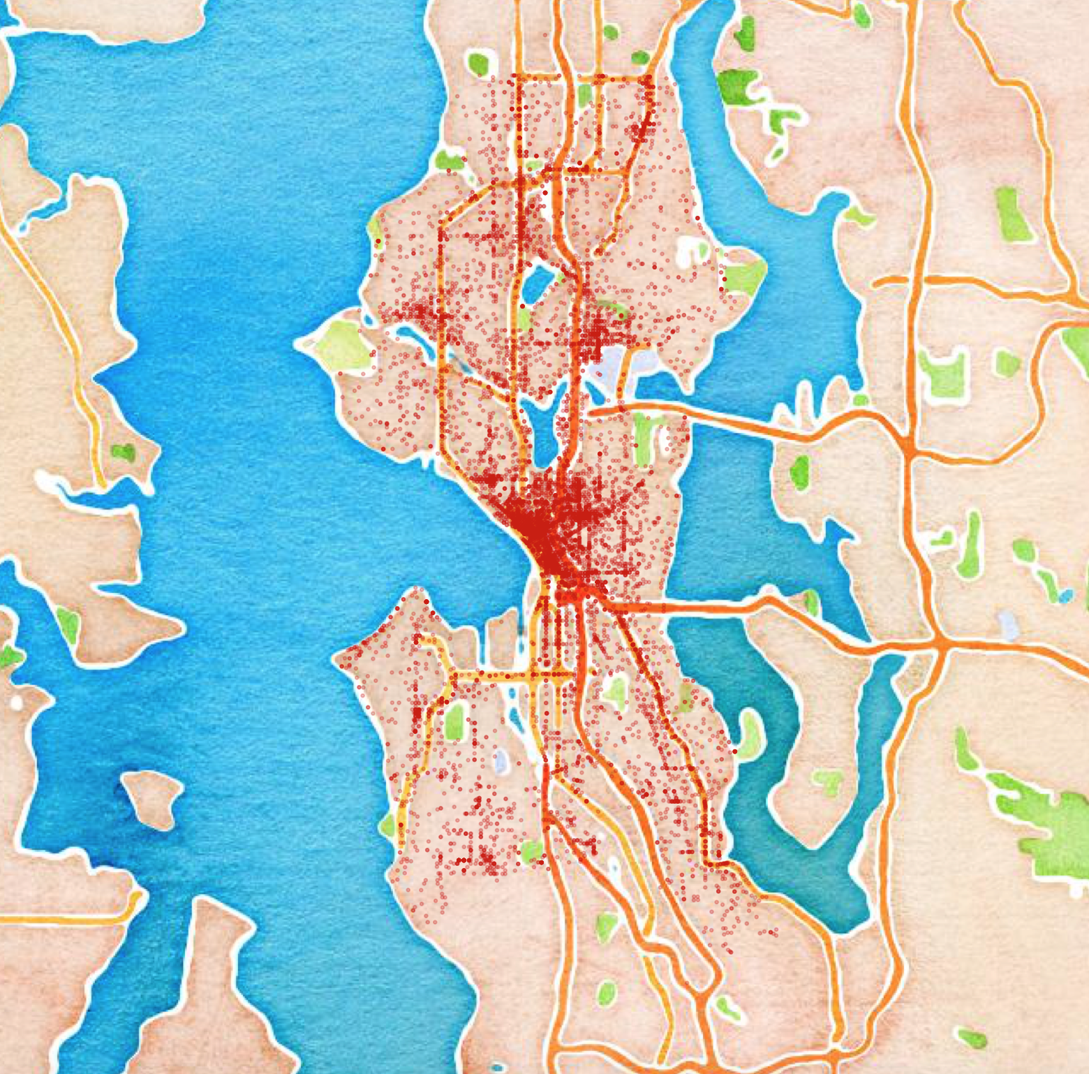
# 10b) watercolor + red geom_point
center = c(lon = -122.335167, lat = 47.608013)
qmap(center, zoom = 11, source = "stamen", maptype = "watercolor") +
geom_point(aes(x = Longitude, y = Latitude), colour = col4, data = i2, alpha=0.3, size = 0.5) +
theme(legend.position="none")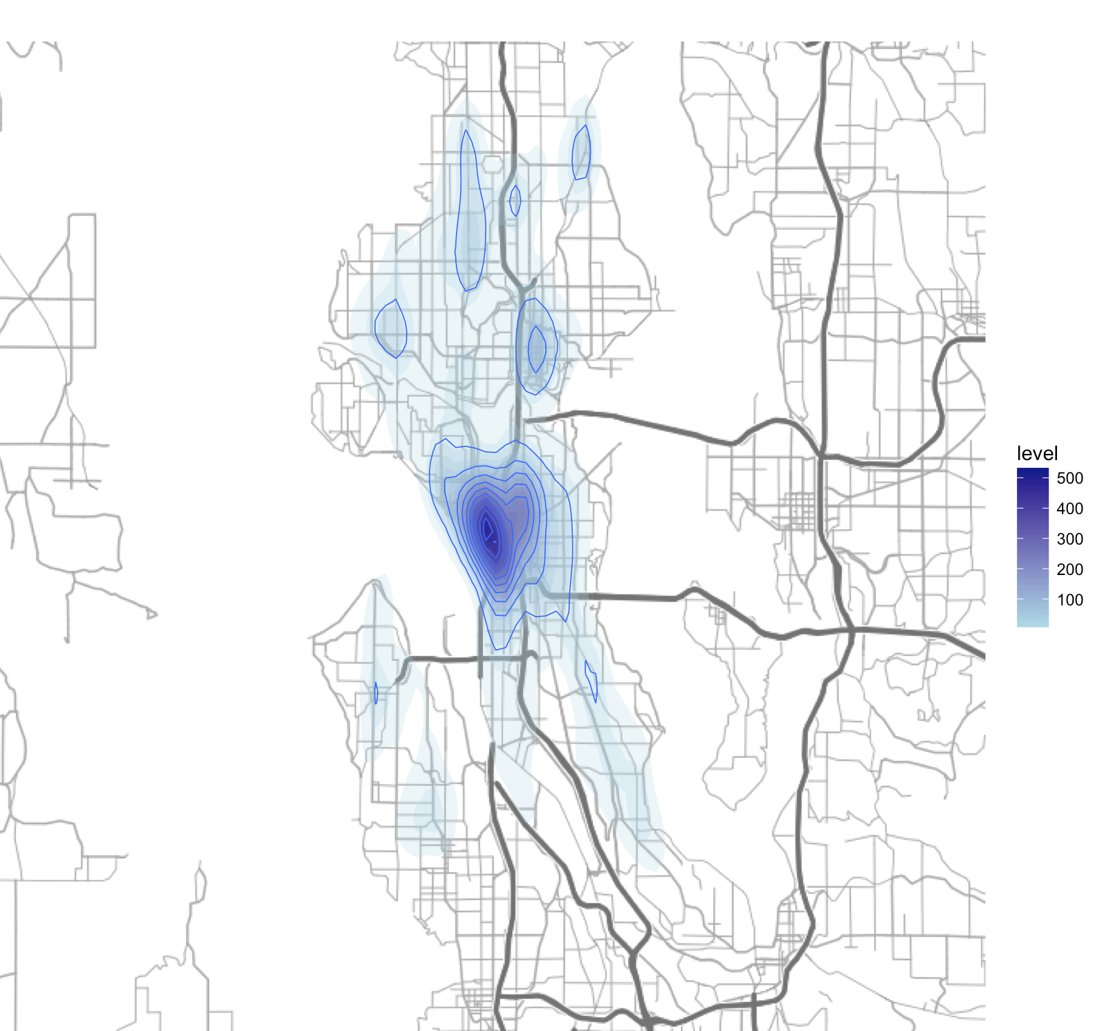
Other Resources For Mapping in R
When investigating ggmap I found this journal by by David Kahle and Hadley Wickham incredibly helpful! Also, in making this tutorial, I found the ggmap cheatsheet posted on the NCEAS website to be great.

Next Steps
If you liked this tutorial, you may be interested in a few other tutorials on this blog. Please check out:
Thank You
Thank you for exploring the Seattle incident data set with me using ggmap and ggplot2 extensions. Please comment below if you enjoyed this blog, have questions, or would like to see something different in the future. Note that the full code is available on my github repo. If you have trouble downloading the file from github, go to the main page of the repo and select "Clone or Download" and then "Download Zip".


