
Data Storytelling Using Flourish Studio
What is data storytelling?
Data storytelling can be thought of as an artistic investment into the effective communication of your analytic findings. A team using data storytelling will take special care to craft a story from the analysis to explain what happened and what should be done. The goal is to educate, engage and inspire the audience with the analytic content.
The bar for data storytelling is higher than a regular reporting. Those who appreciate the art form are always on the look out for effective visualizations. I recently wrote a blog tutorial outlining how to use RAWGraphs to create traditional "Data Science Graphs" without any coding. While I really like RAWGraphs and it's visual impact, I wanted to show a tool that takes our visualizations to the next level in terms of data storytelling functionality. In this tutorial I am going to cover Flourish, a platform for storytelling and visualisation through data. I wanted to have a look at Flourish because it offers advanced graphical techniques, lots of animation features, numerous beautiful mapping capabilities and an actual storytelling feature.
Setup
To make our lives easier, I chose the same data set that we previously used for the "Data Science Graphs (without the code!)" blog. We will be using the data set for traffic violations in the Montgomery County in Maryland. The dataset is quite large in terms of total records. It is updated daily with traffic violation information from all electronic traffic violations issued in the County. There are 35 columns which contain a variety of geographic, subject (vehicle details, gender, race, etc) and circumstance (factors, outcome, etc) information. A full overview can be found here. Since the data set is so dense, I narrowed it down to just the first few weeks of 2018. From there, I made a few data formatting tweaks and created two final data sets for visualization in this tutorial.

1) Download the datasets from my github repo. If you have trouble downloading the files from github, go to the main page of the repo and select "Clone or Download" and then "Download Zip".
2) Sign up for the Flourish beta.
Create a Horserace Chart

1) Select "Add Visualisations" and then select "Horserace Chart"
A horserace chart is a wonderful way of making your standard line graph come to life through animation. Each line has an icon, which helps to create a persona for the category. The persona and the race-like animation engages the audience in the battle of category performance over time.
In this example we are going to create a horserace chart to display the volume of violation types (Warning, Citation, ESERO) over time.

2) Enter a chart name. In this example I call the chart "1-Violation Type Horserace". Select "Data" and then "Import your data".

3) Import in the spreadsheet "Violation_Type_Summary.csv" which you downloaded from the github repo
Ensure the correct columns are selected for visualisation on the right hand side.

4) Select "Preview" to see the chart and "Export & publish" to either get the URL for the chart or to get the embed code for your website. As you can see from above, I've chosen to embed the chart right in this blog post. Note: to get the animation to replay you will need to reload the page.
Create an Icon Map Chart

1) Select "Add Visualisations" and then select "Icon Map".
An icon map allows the user to plot data points on an interactive graph using icons of their choice as markers. While there are a wide variety of data mapping abilities in the market, I like this tool because it is visually appealing and allows for easy customization of the markers displayed. For more map graphing tools, please see my tutorials on Google Fusion Tables and Google Data Studio.
In this example, we are going to map the traffic stops for a 1 day sample and display custom markers based on vehicle type.

2) Enter a chart name. In this example I call it "2-Traffic Violation Icon Map". Select "Data" and then select the tab "Data" and click the button "Import your data".

3) Import in the spreadsheet "Violations_2017_1Day_Sample.csv" which you downloaded from the github repo. Ensure the correct columns are selected for visualization on the right hand side.
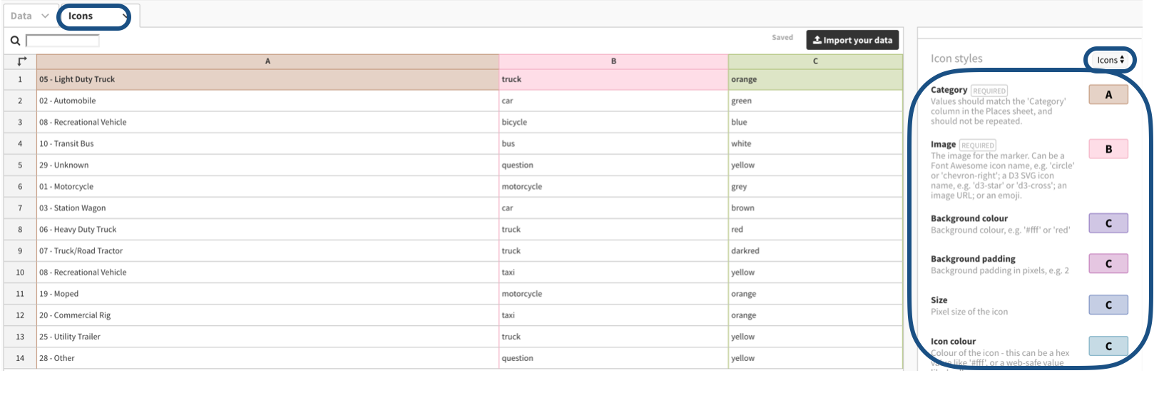
4) Click the "Icons" tab and import the spreadsheet "Vehicle_Type_Color_Icon.xls" which you downloaded from the github repo. Ensure the correct columns are selected for visualization on the right hand side.
5) Visit the chart settings. In the "Map Starting Point" selection area, choose initial latitude=39.101751, longitude= -77.110758 and Zoom: 10.5. In the "Default Icon Styles" selection area, choose size=10.
More Sample Charts
The above content included step by step examples on how to create interactive graphs and animations using Flourish. At this point, the reader should have an understanding of the interface and can explore independently. For those reading along but not in the tool, I'm including a few more samples to display the powerful options available.
Demo - Create a Story
The Flourish platform has a built in storytelling feature. With this feature, they allow a live presentation to be created from the data by combining both narrative and graphs to make a story. In this example, I used the "Survey Chart" type to explore various properties of the traffic violation and their association with vehicle type.
Demo - Time Map
This chart is too beautiful not to show! It allows users to plot color coded data points world wide for different time periods. This can be incredibly powerful in showing changes over time relative to geography.
Demo - Connections Globe
This chart type allows for visualization of geographical data flow over time. Think of the alluvial charts we created in the R Google Analysis and RAWGraphs tutorials but for geography AND animated by time range.
Thank You
Thank you for exploring the Flourish tool with me. I think this tool can easily be a go-to for data storytellers looking to further engage their audience with compelling graphical content.
Please comment below if you enjoyed this blog, have questions, or would like to see something different in the future. Note that data sets are available for download from my github repo. If you have trouble downloading the file from github, go to the main page of the repo and select "Clone or Download" and then "Download Zip".
Written by Laura Ellis


