Predictive Analytics Tutorial: Part 1
Steps to Predictive Analytics Modelling
As you may have seen from my previous blog, predictive analytics is on the move to mainstream adoption. This exciting change means that we are transitioning from inflated expectations, closer to the path of long term productive use.
During the recent years, I have noticed that the over-hype has led to confusion on when and how predictive analytics should be applied to a business problem. This 4-part tutorial will provide an in depth example that can be replicated to solve your business use case. In this tutorial (part 1 of 4), I will be covering the first two phases of predictive modelling.
Step 1: Define the Problem
The situation - In our example use case we have a company (Company ABC) which has very poor employee satisfaction and retention. They have recently conducted a series of exit interviews to understand what went wrong and how they could make an impact on employee retention. A large number of the leaving employees indicated that would have stayed if they were compensated with overtime pay for their extra hours.
The ask - Company ABC has decided to look into the request of paying their employees for overtime hours. As such, they have asked us to build a model which would predict how much money they would need to pay out in this current year. They need a predictive model because they do not actively track employee hours worked.
What data do we have - While Company ABC may not have been tracking employee hours this year, they do have a sample of previous employee data from an in depth employee quiz performed 2 years ago. The information available for the sample employees includes currently available information such as satisfaction, number of projects and salary level as well as hours worked.
What can we do - Using the sample data, we can build a predictive model which will estimate the average hours an employee is likely to work based on their other factors (such as satisfaction, salary level etc). We can then take this predictive model and apply it to the current customer set and provide estimates of hours worked for the current employee base. With the estimated employee hours worked, we can then estimate how much money the company would have to pay out based on the employees salary level.
Notes – Thank you to Kaggle and Ludobenistant for making this data set publicly available.
Step 2: Set UP
Download the sample data set
The data set and associated R code is available on my github repo.
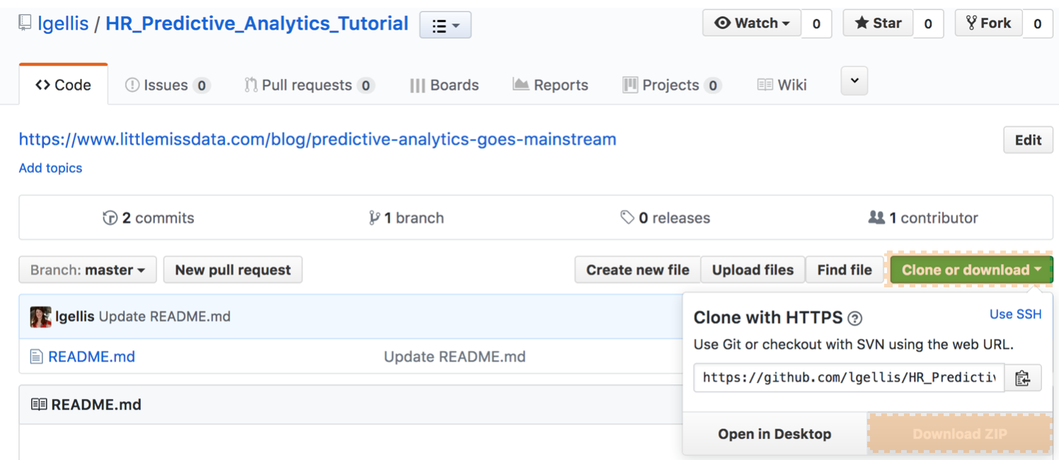
Note: if you have trouble downloading the file from github, go to the main page and select "Clone or Download" and then "Download Zip" as per the picture below.
Pick your tools
There are a wide variety of tools available to explore and manipulate the data. No tool is unequivocally "better" than another one. As long as you are able to do your job in the tool, you're golden. For exploration and visualization; anything from Excel to BI tools such as Tableau, Cognos, Chartio, etc will do just fine. You can also use more advanced statistical packages and programming languages such as R, Python, SPSS and SAS. These all have a wide range of exploration, graphing and predictive modelling options.
For the purposes of this tutorial we are going to use R. I chose R because it allows us to perform all of the above steps to predictive modelling right in the same tool with relative ease. With over 10, 000 packages it's hard to think of analysis you can't do in R. For those of us who care about aesthetics, it has a wide variety of packages such as ggplot2 that make visualizations beautiful. We will explore this further in the next part of this tutorial. Lastly, due to the wide user base, you can figure out how to do anything in R with a pretty simple google search.
Set up your working environment
From above, we know that I chose R as my programming language, but how do I set up my R working environment? We have a couple of options open to us. We can use something like R Studio for a local analytics on our personal computer. The downfall is that local analysis and locally stored data sets are not easily shared or collaborated on.
Enter Data Science Experience (DSX) on IBM Cloud! I firmly believe that all awesome analysis tools should have a free tier so that we users can get started and scale from there. A few days ago, IBM announced the IBM Cloud Lite account which gives access to in demand services such as DSX for free, forever. We are going to be using IBM Cloud Lite and DSX to host and run our R analysis and data set.
A) Sign up for IBM Cloud Lite - Visit bluemix.net/registration/free
Follow the steps to activate and set up your account.
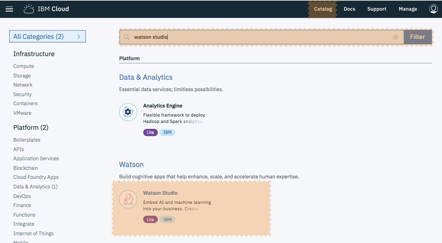
B) Deploy Watson Studio from the catalog. Note this was previously called Data Science Experience
Select the "Lite" plan and hit "Create". You will then be taken to new screen where you can click "Get started”. This will redirect you to the Watson Studio UI.
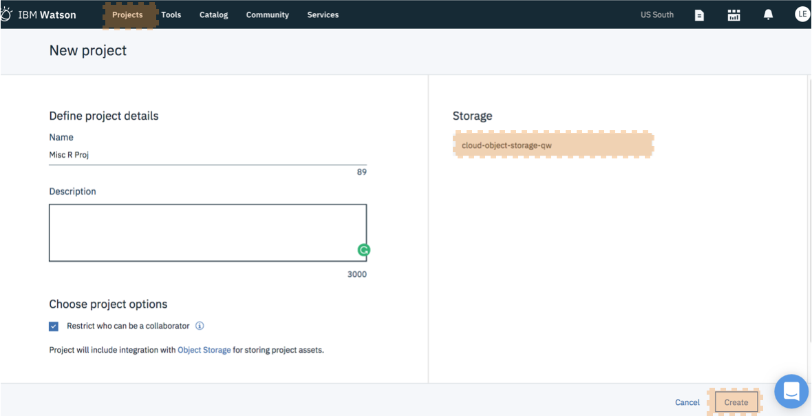
C) Create a New Project - It's best to start by creating a project so that you can store the R notebook and other assets together logically (models, data connections etc). Create the project. If this is your project, you will also need to create an object storage service to store your data. This is free and just a few clicks.
D) Load the Data Asset to the Project - Visit the data connection area by selecting the "1010" button in the top right.
Drag and drop the csv "HR_comma_sep.csv" downloaded from the github repo in the beginning of step 2 to the right hand box.
E) Create a New Notebook - Notebooks are a cool way of writing code, because they allow you to weave in the execution of code and display of content and at the same time.
Select "Assets". Select "New Notebook". Keep the default values but select "R" as the programming language. Click "Create Notebook"
Load the Data in the Notebook - Note that Watson Data Studio allows you to drag and drop your data set into the working environment. This is step "F-1". If you would rather just load the data set through R, please skip to "F-2".
F-1) Load Data via the Web- Inside the notebook, create a new cell by selecting "Insert" > "Insert Cell Above". Place the cursor within the cell.
Visit the data connection area by selecting the "1010" button in the top right. Under your data set, select "Insert to Code". Select "Insert R DataFrame". Back in the notebook, select the cell again and hit "Play" (or right facing triangle button). This will execute the code within the cell, thereby loading the data.
F-2) Load Data Directly with Code
For each step below, the instructions are: Create a new cell. Enter the code below. Run the code by pressing the top nav button "run cell" which looks like a right arrow.
Note: If you need to close and reopen your notebook, please make sure to click the edit button in the upper right so that you can interact with the notebook and run the code.
install.packages("data.table")
library(data.table)
hr= fread('https://raw.githubusercontent.com/lgellis/Predictive_Analytics_Tutorial/master/HR_comma_sep.csv')
G) Do analysis! - Phew! Our prep is done. It takes a bit of time to explain the various parts of setting up your system when using a new tool. But the good news is that now it's done and we can get to the fun part: Exploring data! This will be covered in depth in the next blog. Just so that I don't leave you hanging, let's dip our toe in the water with a little exploratory data analysis (EDA)
Rename the data frame (only necessary when loading data via the web in F-1). The data frame is the object that you created when you loaded the data into the notebook. Usually DSX calls your data frame "df.data.1". Modify the code to the appropriate name if necessary.
hr <- df.data.1Look at column names. Running the names function will allow us to see a full list of columns that are available within the data set.
names(hr)
Look at the raw data. One of the easiest ways to internalize the values available to us is to simply take a peek at the first few rows.
head(hr)Look at how much data there is. Running the dim function will show how many rows (first value) and columns (second value) are in the data set.
dim(hr)View the structure of the columns. Running the str function displays the dimension details from above, sample values like the head function. and it also displays the data type for each column (num, int, factor).
str(hr)View the summary statistics of the columns. Running the summary function displays basic descriptive statistics and distribution for each column.
summary(hr)Stay Tuned
This tutorial will be 4 parts and the fun is just beginning. We have loaded our data set, found out some basic information about it and now we are ready to fly. There are 3 additional parts to this tutorial which cover in depth exploration of the data, preparation for modelling, modelling, selection and roll out!
Thank you for reading. Please comment below if you enjoyed this blog, have questions or would like to see something different in the future.
Written by Laura Ellis


